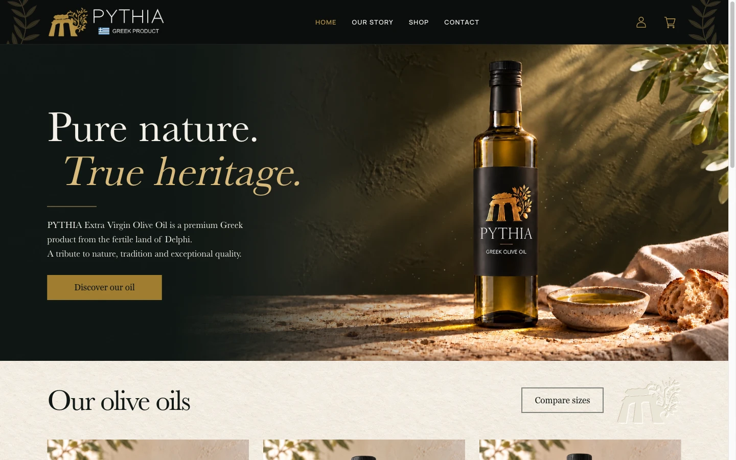
PYTHIA is the Stoforos family’s olive-oil brand from Itea, Greece. I designed and built its website with a custom WordPress theme and WooCommerce, connecting the brand’s story with a small collection of bottles.
The main design task was to give the product a distinct identity while making the range easy to browse. The homepage introduces the oil and its origin; the shop brings the three bottle sizes together; individual product pages give each bottle more space.
Project scope: storefront design, custom WordPress theme development, WooCommerce product presentation and editable product details. The screenshots show the public website on 29 October 2026. Product artwork and catalogue details are illustrative; this case study covers the website work, with no sales or payment-processing results claimed.
Let the bottle introduce the brand
The homepage pairs a large bottle image with “Pure nature. True heritage.” Dark backgrounds, restrained gold details and the sunlit setting carry the label’s visual language into the website.
The bottle and introduction share the opening screen. A “Discover our oil” link leads directly to the shop, giving visitors a clear route from the brand introduction to the range.
Further down, the homepage introduces the bottles and the family’s connection to Itea. That order lets visitors browse the products or spend more time with the story, depending on what brought them to the site.
Make bottle size easy to compare
The shop presents 250 ml, 500 ml and 750 ml bottles in a consistent image treatment. Size is the strongest heading on each card, followed by the bottle name and pricing information.
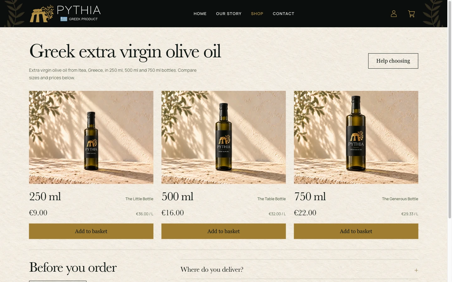
For this range, bottle size is the main difference someone needs to compare. The price per litre appears alongside the bottle price, and each card links to its product page. A “Help choosing” route offers another step for visitors with a question.
This is a collection-specific decision. A shop with several oils, gift sets or other product types would need navigation shaped around those choices.
Keep the product details beside the bottle
The individual product page gives the image more room. The product name, volume, origin, price and quantity control sit together beside it. Delivery and storage information have expandable sections beneath the main controls.
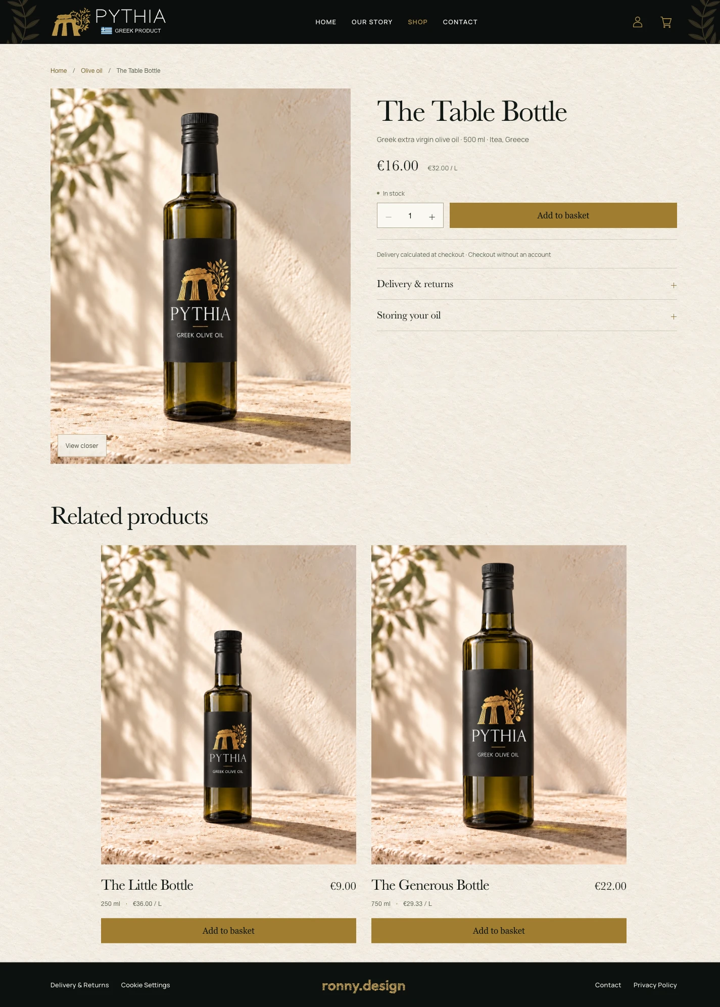
The “Olive oil” breadcrumb returns to the shop. Below the main product, related bottles let visitors continue through the range. The collection and product pages therefore have different jobs: compare the available sizes, then examine one bottle in detail.
Connect the design to editable content
The storefront uses WordPress and WooCommerce for content and product management. I added fields for project-specific details, including the short collection-card note, bottle volume and origin, so the templates can use saved product information.
In a recorded local development test, I changed the card note in the administration area, saved it and confirmed the updated text on the homepage. That verifies one editing path from the field to the storefront. The custom fields belong to this implementation; a similar store needs its own agreement about which details the owner can edit.
Discuss your online store
PYTHIA shows how a focused product range can guide the whole website: its opening composition, collection layout, product information and editing fields.
For a similar project, send me a few representative products, the sizes or options you sell, the images and text you already have, and the details you need to update yourself. Payment and delivery requirements also belong in the brief so we can agree the build scope.
My WooCommerce design and development service explains the process and starting scope. For a broader comparison of product presentation and catalogue navigation, see my ecommerce website design examples.